
Mobile first design means designing for the smallest screen first, then scaling up to tablets and desktops. It matters in 2026 because Google indexes the mobile version of your site, and most visitors arrive on a phone.
Designing with a mobile first mindset has moved from optional to necessary. When you adopt the mobile first design approach, you prioritize the smallest screens in the initial stages of design and then scale up. You create experiences that serve mobile users at the core, rather than treating them as another device.
Mobile First Design (TOC):
- Why Mobile First Design Is Crucial in 2026
- How to Create Better Mobile-First User Experiences (Step by Step)
- Step 1: Prioritize Content and Simplicity
- Step 2: Optimize for Touch Interactions
- Step 3: Focus on Performance and Speed
- Step 4: Simplify Navigation and Make It Thumb-Friendly
- Step 5: Build a Flexible, Scalable Layout
- Step 6: Test, Measure, and Iterate
- How LoginPress Enhances Mobile-First User Experience
- Track Your Website Analytics with Analytify
- Best Practices for Creating Better Mobile First User Experiences
- FAQs About Mobile First Design
- Mobile First: Conclusion
Here are the six steps of a mobile first design process at a glance.
| Step | What to Do | Why It Matters |
|---|---|---|
| 1. Prioritize content | Show the most important content first | Small screens leave no room for clutter |
| 2. Design for touch | Use large, well-spaced tap targets | Prevents mis-taps and frustration |
| 3. Speed up pages | Compress media and cut scripts | Slow pages lose mobile visitors |
| 4. Simplify navigation | Keep menus short and thumb-friendly | Users find what they need faster |
| 5. Build flexible layouts | Use responsive grids that scale up | One design works on every screen |
| 6. Test and iterate | Test on real devices and track results | Finds problems before users do |
Why Mobile First Design Is Crucial in 2026
Mobile first design is crucial in 2026 for three reasons: Google ranks the mobile version of your site, mobile-friendly pages perform better, and new screen types keep appearing. When 96% of people online use mobile devices, they are no longer the secondary screen. They’re the main route to your content, products, and services. If your website isn’t designed with a mobile first mindset, you’re already a step behind your users’ expectations.
For many users, their phone isn’t just their preferred browsing device; it’s their only device. This change means your website’s first impression is on a small screen, not a large monitor.
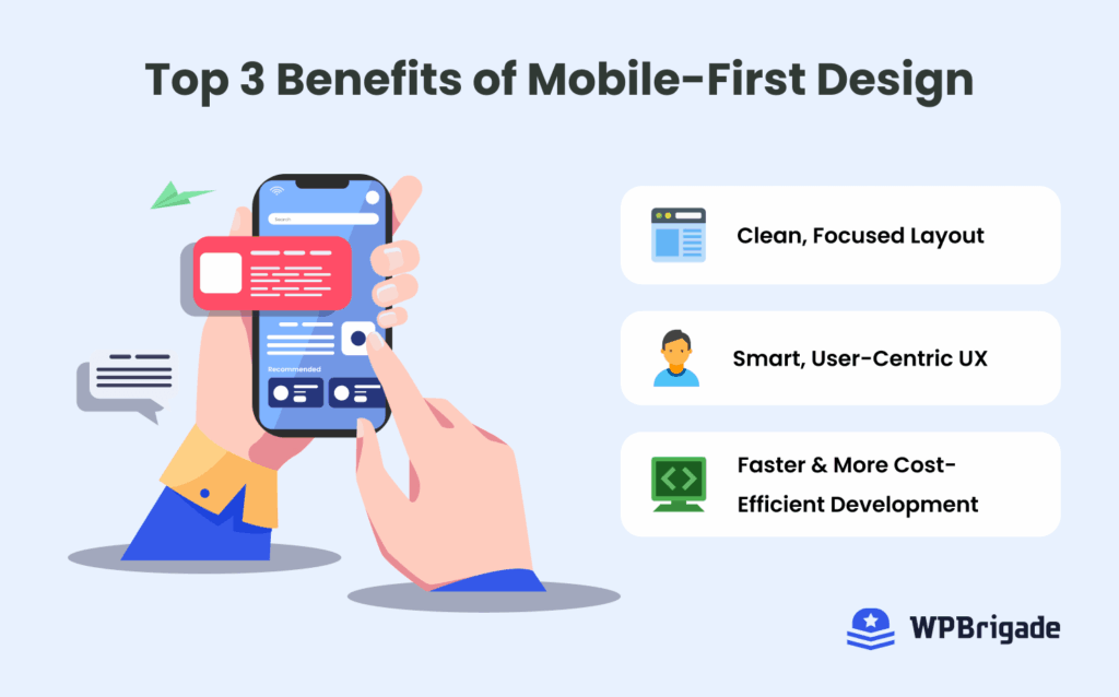
When a design starts with mobile, the experience tends to be faster, easier to read and less frustrating. Here’s why that matters:
1. SEO Rewards Mobile-First Experiences
Google’s switch to mobile-first indexing has made this approach necessary for visibility. Google’s documentation highlights its prioritization of mobile versions of sites, with the smartphone crawler type accounting for 59% of the crawl.
A mobile first web development strategy naturally leads to faster performance, lighter code, and cleaner layouts. These improvements reduce bounce rates and boost engagement, which are the key signals that search engines love.
2. Better Performance, More Retention
On mobile, attention spans are short. Every second of delay risks losing a visitor. A well-optimized mobile first user experience cuts load times and simplifies navigation so users can act quickly. Those actions include reading an article, filling out a form, or making a purchase.
Businesses that embrace mobile first principles consistently see higher engagement and retention. According to recent statistics, mobile-friendly websites see 40% higher conversion rates. When your website is responsive across devices, visitors stay longer, interact more, and return more often.
3. Designing for the Future
The rise of foldable screens, wearable interfaces, and voice-based navigation means web experiences need to be flexible. A mobile first responsive web design can increase repeat website visits by 75%. Starting small lets your layout scale up smoothly, from smartphones to tablets, desktops, and whatever comes next.
In 2026, mobile first design isn’t a trend; it’s the new foundation of great UX, better SEO, and long-term growth. It’s about meeting users where they are and progressively building a web experience that fits in their hands.
How to Create Better Mobile-First User Experiences (Step by Step)
You create better mobile-first user experiences in six steps: prioritize content, design for touch, speed up pages, simplify navigation, build flexible layouts, and test. Designing with a mobile-first mindset is more than just rearranging layouts. It’s about rethinking how your users engage, interact, and convert on smaller screens, and then scaling up.
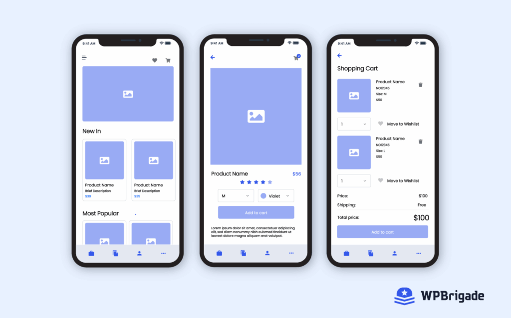
Follow these steps to do that in 2026:
Step 1: Prioritize Content and Simplicity
Begin by reviewing the core content your mobile users need. On a mobile screen, you don’t have the luxury of space or context that a desktop might provide. Instead, ask: What is the one thing mobile users want to do first when they land on your site? What can be delayed or set aside?
Here are some implementation tips you can follow:
- Display the primary call to action (CTA) prominently above the fold on mobile.
- Remove or hide extra content (e.g., long sidebars, excessive menu options) in the mobile view.
- Use a single-column layout for mobile; avoid complex grids or multi-column layouts that require zooming or horizontal scrolling.
According to recent statistics, non-mobile-optimized sites have a 60% bounce rate. A cluttered mobile homepage or slow layout risks losing those users immediately. Also, UX stats show that 74% of visitors are likely to return to a site with good mobile UX.
Step 2: Optimize for Touch Interactions
On mobile, everything is about the fingertips: taps, swipes, and gestures. You need to design the UI in ways that feel native to mobile, not just a smaller version of desktop. Here are some implementation tips for you to follow:
- Ensure tap targets, such as buttons and links, are large enough (touch target area of 44×44px or more) and meet the Web Content Accessibility Guidelines (WCAG).
- Provide generous spacing between interactive elements to prevent accidental taps. According to one study, 66% of mobile sites place tappable elements too close together.
- Avoid hover-only interactions because there is no hover on mobile screens.
- Use mobile-friendly gestures where appropriate, such as swiping to reveal options, pulling to refresh, and so on.
- Consider thumb-reach zones. Users commonly hold phones in one hand, so placing primary controls in the bottom half of the screen can help.
Poor touch design not only frustrates your users but can also increase abandonment and bounce rate. One recent mobile UX performance report found that, despite longer mobile session durations, mobile rage clicks increased by 15.6%. When your interface doesn’t respond to touch, you lose engagement.
Step 3: Focus on Performance and Speed
Mobile devices often run under limited network conditions and with smaller processors or memory than desktops. A mobile-first design must plan for these constraints.
A few implementation tips:
- Optimize images with responsive image sizes, compression, and lazy-loading for off-screen content.
- Minimize render-blocking CSS and aim for a fast initial render.
- Use browser caching, service workers, and CDNs to serve assets faster.
- Trim down unnecessary web fonts, animation-heavy code, and third-party scripts.
- Regularly test actual mobile network performance (3G/4G/5G) and on real devices, not just emulators.
Speed and performance are non-negotiable: one report found that a poor mobile UX can drain up to 35% of sales revenue. So if you’re serving a mobile majority, you must serve it fast.
Step 4: Simplify Navigation and Make It Thumb-Friendly
Navigation on mobile should be intuitive, minimal, and designed for one-handed use. It should not overwhelm the user or require mastering complex menus. Here are some tips to simplify navigation:
- Use a hamburger or bottom navigation bar on mobile devices, revealing deep links only when necessary.
- Prioritize the top 3-5 navigation items. Hide less important options in menus.
- Use simple back buttons where needed.
- Avoid forcing users to scroll horizontally or using overly detailed menus that require zooming.
- Ensure search is visible if your site has many pages/products.
Mobile users engage 15% more with responsive platforms. When users struggle to find what they need quickly, they leave. Mobile users in particular expect streamlined experiences. E-commerce statistics show that slow loading times are a top reason for 88.5% of users to consider going elsewhere. Good navigation reduces friction, helps users convert, and supports retention.
Step 5: Build a Flexible, Scalable Layout
Once the mobile version is solid, you scale up. The mobile-first concept means you design from the smallest screen upwards. Here are the implementation tips:
- Write your CSS mobile-first, so base styles apply to mobile.
- Use grids, percentage widths, and relative units (em, rem) instead of fixed pixels.
- Use CSS features like Flexbox and CSS Grid to build responsive layouts that adapt to different screen sizes.
- Make image, video, and other media elements flexible so they don’t overflow on small devices and scale gracefully.
- Test the layout across a range of devices: small phones, large phones, and desktops.
92% of users prefer websites that are easy to navigate, emphasizing the role of intuitive design in user retention. This is why a mobile-first layout is about building a foundation that remains maintainable and performance-aware. It ensures your site works smoothly on any screen a user chooses, including newer device form factors.
Step 6: Test, Measure, and Iterate
To build a mobile-first user experience, you need to measure and continuously improve based on real user behavior. Here are some of the implementation tips for testing and iterating:
- Use analytics to track mobile vs desktop behavior.
- Employ mobile device usability testing.
- Use heatmaps or session replay tools for mobile sessions to see where users struggle.
- Set KPIs around device experience.
- Update and test improvements in cycles. You should treat your mobile version as the primary version.
As one UX-statistic collection noted, good mobile UX can bring up to 74% of visitors back for more. If you don’t test and iterate, you’re leaving retention and conversion on the table.
By following these steps, you’ll build a mobile first web design that isn’t just about fitting on small screens. You’ll be able to deliver a superior mobile first user experience that drives engagement, conversions, and long-term retention.
How LoginPress Enhances Mobile-First User Experience
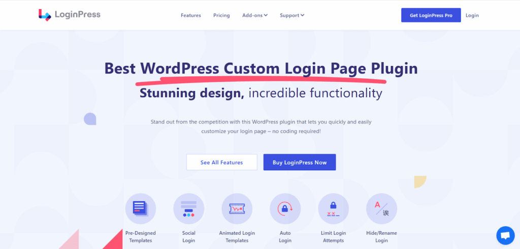
A true mobile first website isn’t just about visuals but about how users interact with your platform from the very first screen: the login page. That’s where LoginPress helps.
LoginPress lets you customize and optimize your WordPress login page without coding, ensuring it looks and works well on any device. Its responsive design features automatically adapt to different screen sizes, making login forms clean, touch-friendly, and fast-loading.
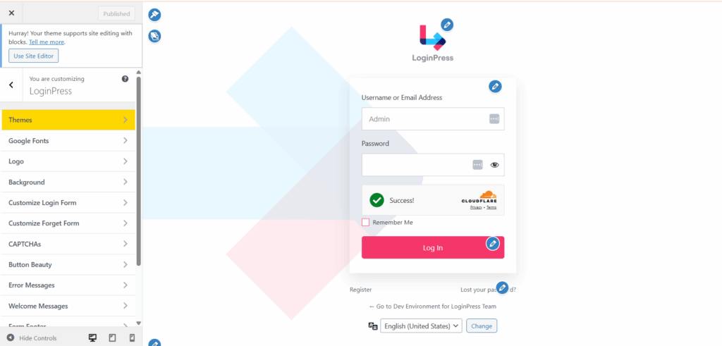
With options to adjust layouts, colors, and branding, plus support for social login and reCAPTCHA, LoginPress helps reduce friction and improve engagement, especially for mobile visitors who prefer quick, one-tap access.
Learn more about How to Create a Mobile Friendly Login Page Using LoginPress.
If you’re focusing on mobile first web development, adding LoginPress ensures your user journey starts right: modern, branded, and built for every screen.
Track Your Website Analytics with Analytify
Analytify shows mobile performance in GA4 inside WordPress, so you can see if your mobile first design works. Creating a mobile first design is only half the job. The other half is knowing how it performs in the real world. That’s where Analytify helps you easily track your performance.
Analytify helps you track and analyze your website’s performance directly inside WordPress. The Analytify overview dashboard provides clear, easy-to-read insights into how users interact with your site.
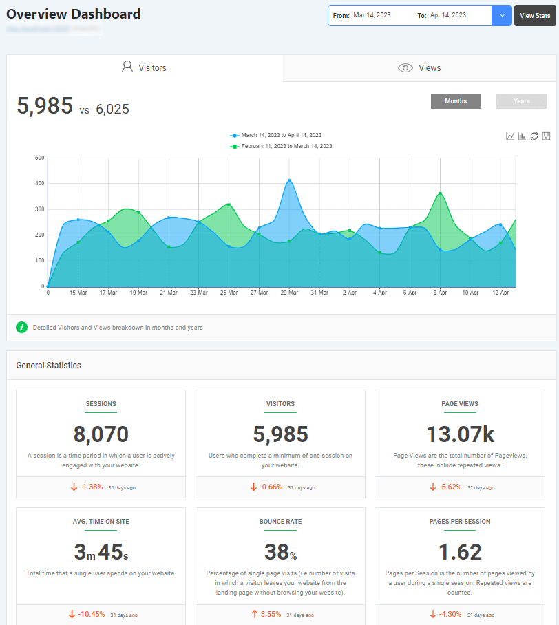
You can see metrics like bounce rate, session duration, traffic sources, and conversions, all broken down by device type.
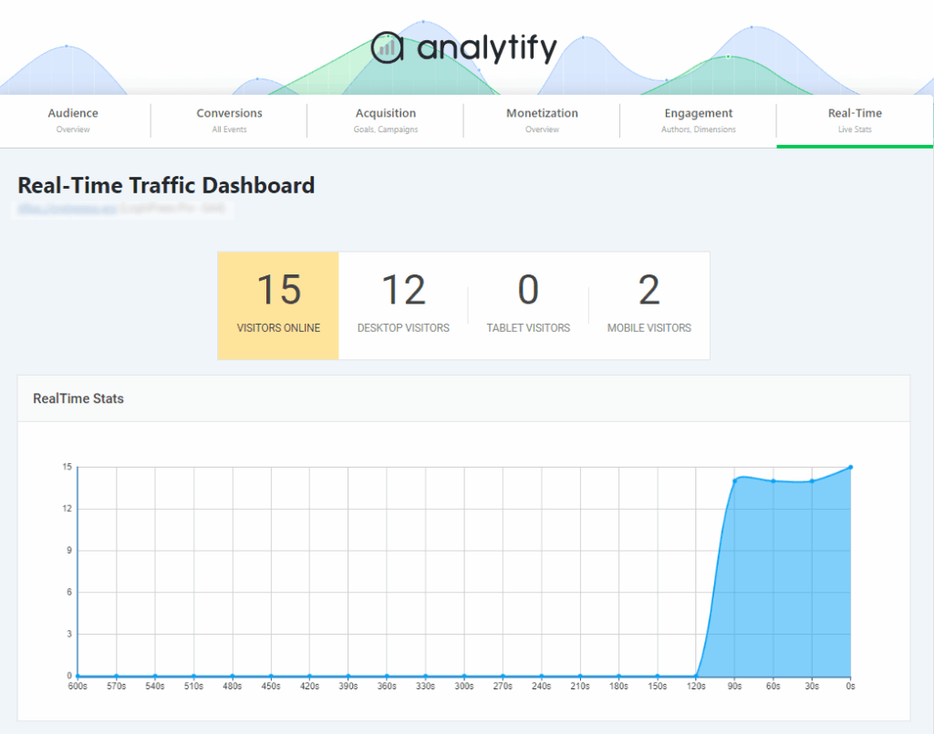
This data reveals what’s actually working in your mobile first user experience. You can easily track where visitors are dropping off in real-time.

With that knowledge, you can edit layouts, speed, and content to improve engagement and retention. Optimizing UX is vital, but tracking its performance across your platform is crucial.
Best Practices for Creating Better Mobile First User Experiences
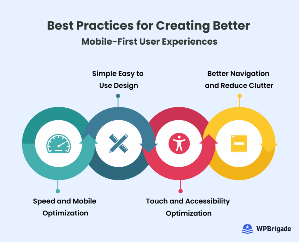
The four best practices for mobile first UX are fast pages, simple design, touch-friendly accessible controls and clutter-free navigation. Designing for mobile first is all about making every interaction with your site effortless.
1. Prioritize Speed and Mobile Performance
Mobile users expect instant responses. A fast site improves both UX and SEO, which is a win-win for every mobile-first brand. According to research, even a 1-second delay in page response can result in a 7% reduction in conversions.
2. Focus on Simple, Easy-to-Use Design
Clarity beats complexity on smaller screens. Keep your layout clean, text readable, and calls to action bold and visible. Eliminate clutter to help users focus on what matters.
3. Optimize for Touch and Accessibility
Design with thumbs in mind. Make buttons large enough to tap easily and leave enough spacing between interactive elements. Follow accessibility guidelines so users with disabilities can navigate smoothly.
You can learn more in Microsoft’s inclusive design toolkit about how beneficial it is to make your site accessible to disabled users.
4. Reduce Clutter and Improve Navigation
Less is more on mobile. Remove unnecessary elements and focus on what users actually need. Keep menus short, use clear icons, and organize content logically so visitors can find what they’re looking for without endless scrolling or confusion.
By combining speed, simplicity, and inclusivity, you ensure your mobile first design delivers not just a responsive layout, but a truly user-centered experience.
FAQs About Mobile First Design
Mobile First: Conclusion
In 2026, designing with a mobile-first approach is the foundation of excellent user experience and long-term growth. From speed and simplicity to accessibility and analytics, every detail counts in creating a digital experience that users love.
By combining smart tools like LoginPress for smooth mobile login pages and Analytify for real-time performance insights, you’re not just building a website. You’re creating an experience that adapts, engages, and converts.
For more related posts, check:
So, is your website truly ready to deliver a mobile-first experience in 2026? Let us know in the comments below which practice you will be implementing.
Leave a Reply