
WordPress accessibility means building your site so people with visual, hearing, motor or cognitive disabilities can use it, following WCAG 2.2 Level AA. It matters because it widens your audience, lowers legal risk and improves SEO.
Today, accessibility is not just a tech box to tick. It is part of good design, the law, and a better user experience. For instance, an accessible website helps people with visual, hearing, motor, or cognitive disabilities use your site without barriers. It also cuts ADA risk, improves search rankings, and builds trust in your brand.
In this guide, you’ll learn what accessibility means, why it matters, common problems, how to fix them, which tools to use, and what large companies must consider.
Table of contents
- What WordPress Accessibility Means
- Common Accessibility Challenges in WordPress
- How to Make WordPress Websites Accessible
- Accessibility for Enterprise and SaaS WordPress Sites
- How to Measure Accessibility Performance in WordPress with Analytify
- Accessibility and AI Search (GEO)
- WordPress Accessibility: Common Mistakes to Avoid
- Frequently Asked Questions About WordPress Accessibility
- WordPress Accessibility: Conclusion
What WordPress Accessibility Means
WordPress accessibility means every visitor, including people with visual, hearing, motor or cognitive disabilities, can read text, move through pages, fill forms, play media and use features without barriers.
Accessibility follows global standards such as WCAG 2.2, ADA guidelines, and Section 508. Specifically, these rules cover how sites should handle text, color contrast, menus, media, forms, and interactive elements.
In practice, good WordPress development rests on clean semantic HTML, proper ARIA roles, and media with alt text, captions, and transcripts. When your structure and text follow these basics, screen readers, keyboard navigation, and voice control tools can read your site correctly.
Legal and Business Importance of Web Accessibility
Accessibility is no longer optional. In many countries, like the US, sites must follow ADA compliance rules. If a WordPress site does not meet basic accessibility needs, businesses can face complaints, lawsuits, or fines. Common faults include text you cannot read, missing alt text, keyboard traps, and forms you cannot use.
Besides the law, accessibility brings strong business gains. For example, it helps you reach a wider audience, including millions who rely on assistive technology. Similarly, sites that work for all show care and build brand trust, especially for large companies and SaaS brands. As a result, when your site is easier to use, more people stay longer, finish tasks, and come back.
In short, accessibility cuts risk, protects your brand, and drives long-term growth with a better, barrier-free experience.
SEO and User Experience Benefits
Accessibility improves both search rankings and user experience. When your WordPress site uses clear headings, proper structure, plain links, and text people can read, search engines grasp it better. For example, Google favors pages with clean HTML, tidy menus, and text with meaning, all of which are core access work.
Meanwhile, pages that work for all make the journey smoother. For instance, good color contrast, clear focus states, menus you can tab through, and tidy text cut confusion. As a result, people stay longer, bounce rates drop, and more of them take part.
Accessibility also supports crawling: better structure, clearer text, and simpler menus help search engines crawl your site. At the same time, users get a site that is simpler, faster, and easier to use on any device.
Common Accessibility Challenges in WordPress
The most common WordPress accessibility problems are missing alt text, poor contrast, keyboard traps, unlabeled forms and theme or plugin clashes.
- Missing alt text on images or decorative media – without it, screen readers cannot explain images to blind and low-vision users.
- Poor color contrast and small type – low contrast or tiny fonts make reading hard for users with low vision.
- Keyboard and focus order faults – users who rely on keyboards may get stuck or lose their place if menus and forms are not built well.
- Forms without labels or ARIA tags – unlabeled forms confuse screen readers and other assistive tools.
- Plugin or theme clashes – some themes or plugins do not follow best practice, which creates barriers.
For example: a slider that spins on its own with no pause button can block screen reader and keyboard users.
In short, these faults show why access must be part of theme choice, writing, plugin use, and design.
How to Make WordPress Websites Accessible
Make a WordPress site accessible in four steps: choose accessible themes and plugins, improve content, fix navigation, then test and maintain.
1. Use Accessible Themes and Plugins
An accessible site starts with the theme and plugins you choose:
- Good Themes: Choose themes built with semantic HTML, which means the code tells screen readers what each part is. Check they support ARIA roles, which add extra clues to things you click, and keyboard use, so people can reach every menu, button, and form with the keyboard alone.
- Helper Plugins: Plugins can fill gaps and make fixes simpler:
- LoginPress makes login forms work for all, with proper labels, keyboard use, and clear focus cues.
- Simple Social Buttons makes social icons easy to read and use with screen readers, plus bigger tap areas.
- LoginPress makes login forms work for all, with proper labels, keyboard use, and clear focus cues.
As a result, these tools help your site avoid many common barriers without heavy code.
2. Improve Content Accessibility
Clear content helps all users understand and move through your site. Key steps include:
- Descriptive Headings: Set out pages with clear headings (H1, H2, H3) that match how the text is built. This helps screen reader users move fast.
- Alt Text for Images: Every image should have alt text with meaning. Images that are just for show can use empty alt tags, so screen readers skip them.
- Captions for Videos: Add captions so deaf and hard of hearing users can follow along.
- Readable Text: Use short sentences, clear language, and proper contrast. Avoid tiny fonts or background colors that make reading hard.
- ARIA Roles for Dynamic Content: Parts like sliders, modals, or accordions need ARIA roles, so assistive tools know how to read them.
3. Navigation and Interaction Accessibility
Likewise, users need to move through your site without barriers:
- Keyboard Accessibility: All menus, buttons, links, and forms should work with the keyboard. Test with the Tab and Enter keys.
- Logical Tab Order & Focus: Check that focus moves in a set order and is easy to see. This is key for keyboard-only users.
- Forms & Error Messages: Every input should have a label, and users should see clear errors when a form is wrong or half-filled.
- Plugin Support: WPBrigade’s LoginPress and Simple Social Buttons provide accessible components, so login forms and social buttons follow best practice.
4. Testing and Maintenance
Accessibility is not a one-time task. Ongoing tests keep your site open to all:
- Automated Testing Tools: Use WAVE, Axe, and Lighthouse to spot faults like missing alt text, color contrast errors, or ARIA gaps.
- Manual Testing: Always check with screen readers (NVDA, VoiceOver, JAWS) and the keyboard, so you experience the site as users with disabilities do.
- Regular Audits: Redo your checks each time WordPress, themes, or plugins change.
- Content Creator Training: Make sure your team knows how to keep new pages, posts, and clickable parts open to all.
Overall, these steps keep your WordPress site easy to use, open to all, and within the law, while WPBrigade’s plugins make the work simpler.
Accessibility for Enterprise and SaaS WordPress Sites
Accessibility matters even more for enterprise and SaaS WordPress sites, because complex flows, many users and changing content create more barriers. Making sure all users, from clients to staff, can use your platform safely is key for the law, for ease of use, and for growth.
1. Multi-User Content Creation
Large WordPress sites often have many editors, authors, and admins. Therefore, access must extend to:
- Dashboards and backend interfaces: Menus, buttons, and editing tools should work with the keyboard, with clear focus cues.
- Forms and content submission: Staff filling out forms or adding files need clear help and error notes.
By building flows that work for all, companies reduce errors, ease teamwork, and keep a consistent experience across all public pages.
2. Role-Based Content Workflows
Meanwhile, each user role should have checks that fit the job:
- Editors and admins can use checklists or plugin tools, so headings, alt text, and ARIA roles are added before a page goes live.
- Sign-off steps can include these checks, which stops inaccessible pages from going live.
As a result, the work is built into the process, not bolted on later.
3. Accessible Interactive Elements
Large firms and SaaS sites often use sign-up forms, dashboards, trials, and report tools. These must be easy to use with a keyboard, screen reader ready, and simple to move through:
- LoginPress can be used for login and sign-up forms that work for all.
- Simple Social Buttons keeps share tools easy to read and use for all.
- Finally, charts, tables, and live content should have ARIA roles, clear labels, and visible focus states.
4. Highlighting WPBrigade Expertise
For larger company and SaaS WordPress sites, these are the checks I’d make:
- Compliance with WCAG 2.2, ADA, and Section 508 standards.
- Checks are built into the writing flow.
- Plugins and themes are tested to work with screen readers and similar tools.
- End users, editors, and admins all get a smooth ride.
How to Measure Accessibility Performance in WordPress with Analytify
Measure accessibility performance in WordPress by tracking device engagement, page behavior and social interactions in Analytify. Better accessibility is only half the job; you also need to measure how users interact with your accessible WordPress site. Analytify helps you track real user habits, so you can see if your changes work.
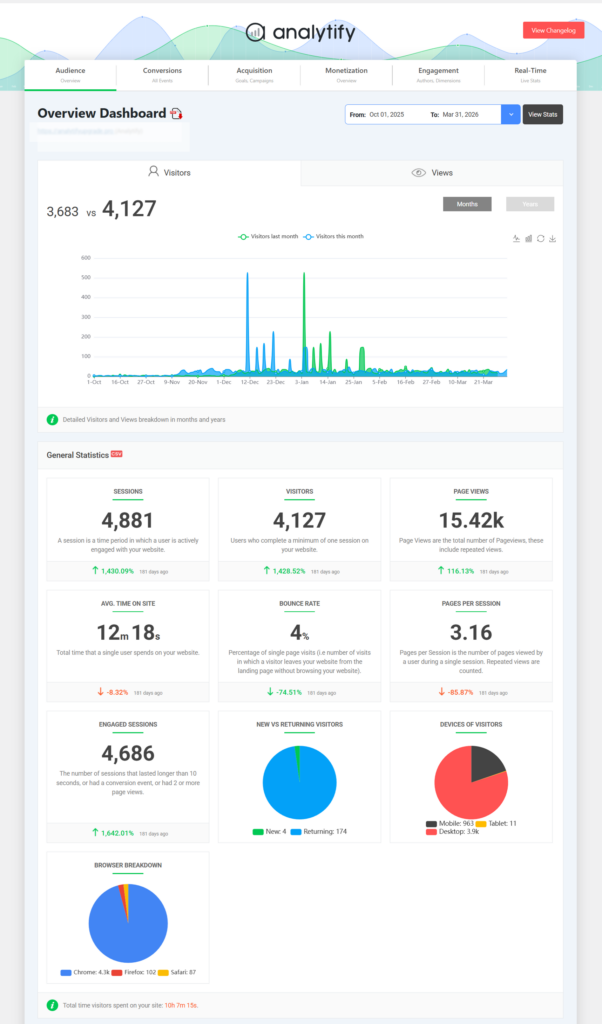
Here is how to read the numbers using Analytify and GA4:
By keeping accessibility in view at every level, enterprises not only avoid legal risks but also increase usability, customer satisfaction, and engagement.
1. Track Engagement Across Devices
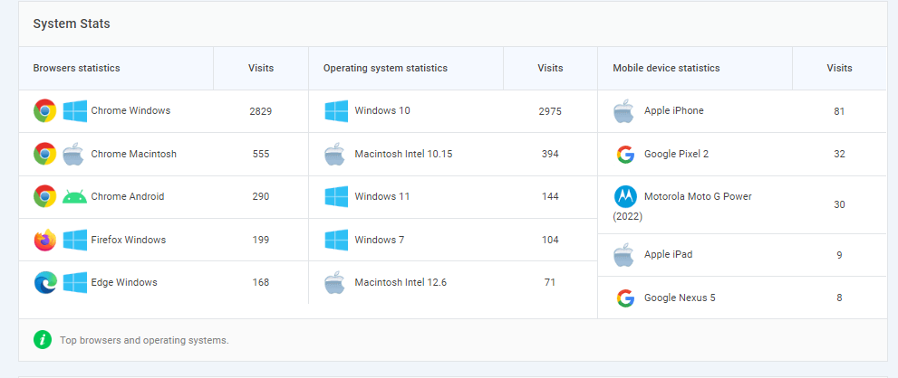
- Accessibility fixes often affect phone and tablet users.
- Use Analytify >> Devices to view metrics like:
- Sessions per device
- Average time on page
- Bounce rate
- Sessions per device
Comparing before and after can show whether your changes work better on each device.
2. Monitor Page Behavior
- Clear headings, links, and menus help reading and flow.
- In Analytify >> Top Pages, track:
- Top exit pages
- Pages with high bounce rates
- Average engagement time
- Top exit pages
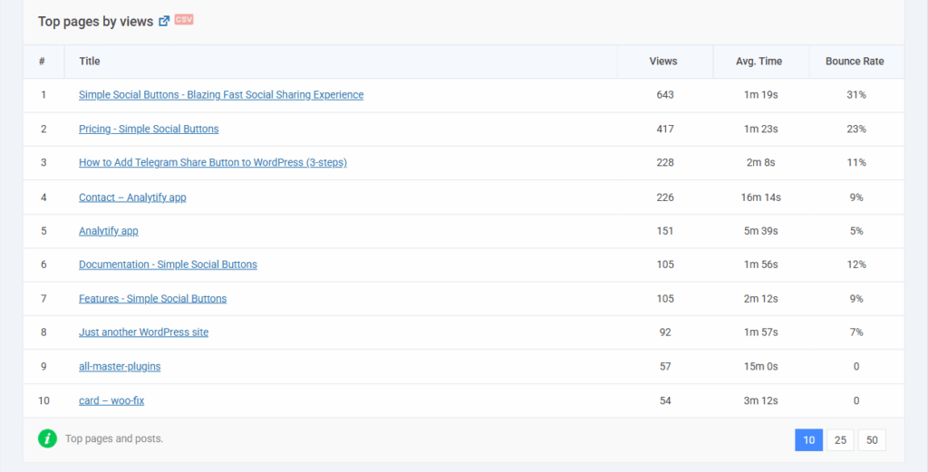
Pages with very low time on page may still have barriers.
If you use LoginPress for login forms, you can watch login success or drop-off to see if your changes help.
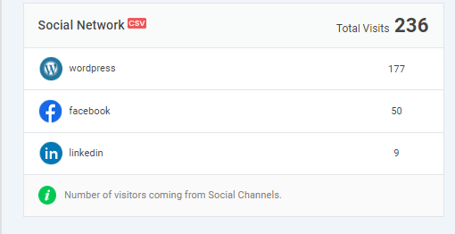
3. Monitor Social Interactions
- Accessible buttons are easier for everyone to use.
- Track button clicks in Analytify >> Social Stats to see whether more people use the share buttons (e.g., via Simple Social Buttons).
Accessibility and AI Search (GEO)
Accessible pages are also easier for AI search engines to read and cite, because both need clear structure, plain labels and text alternatives. The work that makes a page easy for a screen reader also makes it easy for a machine to read. So the same fixes serve two ends at once.
Generative engines such as Google AI Overviews, ChatGPT, and Perplexity must parse your page before they can quote it. Clean markup is not just kind to users. It is also how you get cited.
| What you fix | What it gives readers | What it gives AI engines |
|---|---|---|
| Semantic HTML | Screen readers can name each part of the page | A clear layout the model can follow |
| Clear headings | People jump straight to the part they want | Question and answer pairs it can lift |
| Alt text on images | Blind users learn what the image shows | Words for content it cannot see |
| Captions and transcripts | Deaf and hard of hearing users can follow | Full text of media it cannot watch |
| ARIA roles | Tools know what a widget does | A label it can read for live parts |
| Real link text, not “click here” | Users know where a link goes | Context for what you linked to |
| Set reading and tab order | Keyboard users move in a clear order | Source order that matches meaning |
| Strong contrast and readable type | Low-vision users can read the page | No direct gain. This one is for people only |
Notice the last row: not every fix helps a machine. Contrast and font size matter for people, full stop. Do this work for your users first. The search gain is a bonus, not the reason.
A GEO Checklist for WordPress Pages
If you want a short list to work through, start here. Each row is a small job, and most take minutes.
| What to add | Why AI engines use it | How to do it in WordPress |
|---|---|---|
| Headings phrased as real questions | They lift direct answers from them | Use the heading block and write a question |
| A short answer under each heading | It gives a clean quote to pull | Make the first line answer the heading |
| An FAQ block | It pairs a question with an answer | Use the FAQ block in your editor |
| Alt text on every image that means something | It describes parts that are not text | Fill the alt field in the media library |
| A transcript under each video | It turns media into text | Paste the text below the embed |
| Links with real anchor words | It shows how your pages relate | Link with words that name the target |
| Fast mobile pages | Slow pages are harder to fetch and read | Work on Core Web Vitals |
| A theme with clean markup | It cuts parsing errors | Pick a theme that follows WCAG 2.2 |
In short, a page built for people with disabilities is already most of the way to a page an AI engine can quote. That is the best part of this work: you do it once, and it pays twice.
WordPress Accessibility: Common Mistakes to Avoid
Common WordPress accessibility mistakes include ignoring keyboard focus, poor contrast or inaccessible media, and relying only on automated testing. Here is how to fix them:
1. Ignoring Keyboard Navigation and Focus Order
- Mistake: Users cannot tab through menus, buttons, or forms in a clear order.
- Fix: Make sure every part you click can be reached by keyboard, and keep a clear tab order. Use clear focus cues to show which part is live. Plugins like LoginPress help make login forms keyboard-friendly.
2. Poor Color Contrast or Inaccessible Media
- Mistake: Text is hard to read, buttons blend in, or images lack alt text.
- Fix: Use strong contrast, fonts people can read, and clear alt text for all images. Add captions to help deaf and hard of hearing users.
3. Relying Solely on Automated Testing
- Mistake: Running only WAVE or Axe and assuming the site is fine.
- Fix: Combine automated tests with manual checks using screen readers (NVDA, VoiceOver, JAWS) and the keyboard alone.
4. Using Incompatible Plugins or Themes
- Mistake: Themes or plugins that ignore best practice can break your site.
- Fix: Choose themes that follow WCAG 2.2 and test plugins before use. Use helper plugins like WP Accessibility, LoginPress, or Simple Social Buttons.
5. Neglecting Maintenance
- Mistake: The work is done once, then ignored at each update.
- Fix: Run audits each time WordPress core, themes, or plugins change. Train your writers to keep good habits.
Frequently Asked Questions About WordPress Accessibility
WPBrigade LoginPress – accessible login forms
Simple Social Buttons – accessible social sharing
WP Accessibility and One Click Accessibility – improve headings, forms, and skip links
WordPress Accessibility: Conclusion
Web accessibility is no longer optional. It is a core part of modern WordPress work. Accessible sites reach more users, improve SEO, cut legal risk, and give a smoother experience to everyone, including people with visual, hearing, motor, or cognitive disabilities. By using good themes, adding proper labels and alt text, checking keyboard use, and testing often, you build a site that is open to all and ready for what comes next.
WPBrigade helps businesses build WordPress sites that meet WCAG 2.2, ADA, and Section 508 standards. With tools like LoginPress and Simple Social Buttons, we make the work easier across login pages, social sharing, and user flows.
If you want a fast WordPress site that works for all and meets the rules, contact WPBrigade to get started.
You may also like to read 20+ WordPress Best Practices and Tips.
Now over to you. If you could instantly see which accessibility improvements drive the biggest engagement boost on your site, what’s the first thing you’d want to measure?
Leave a Reply