The Styles tab in RPT plugin enhances the user experience by showcasing related content with thumbnails, enabling better content discovery and engagement. Customizing the visual appearance of these thumbnails ensures they align with your site’s design and branding.
In this guide, you’ll learn the settings that control the visual appearance and layout of the related post thumbnails. These options offer flexibility in design, typography, and spacing, allowing you to tailor the related posts section to match your WordPress website’s style.
Style Tab in RPT Settings #
By customizing the visual appearance of your related posts, the Style Tab offers flexibility to ensure your thumbnails align with the overall design of your site. Whether you prefer a grid layout or a list format, these settings give you complete control over how your content is presented.
With options to adjust spacing, font sizes, and colors, you can create a consistent, visually appealing experience across all devices. These changes not only enhance aesthetics but also improve usability, ensuring a seamless browsing experience for your visitors.
Let’s see in detail how you can benefit from the Style tab settings.
Thumbnail Title Tag #
- Description: Select the HTML tag used for the thumbnail titles.
- Options:
- H2 (Default)
- H3
- H4
- etc.
- Use Case: Helps maintain semantic structure and hierarchy in your HTML markup, which is important for SEO (Search Engine Optimization) and accessibility.
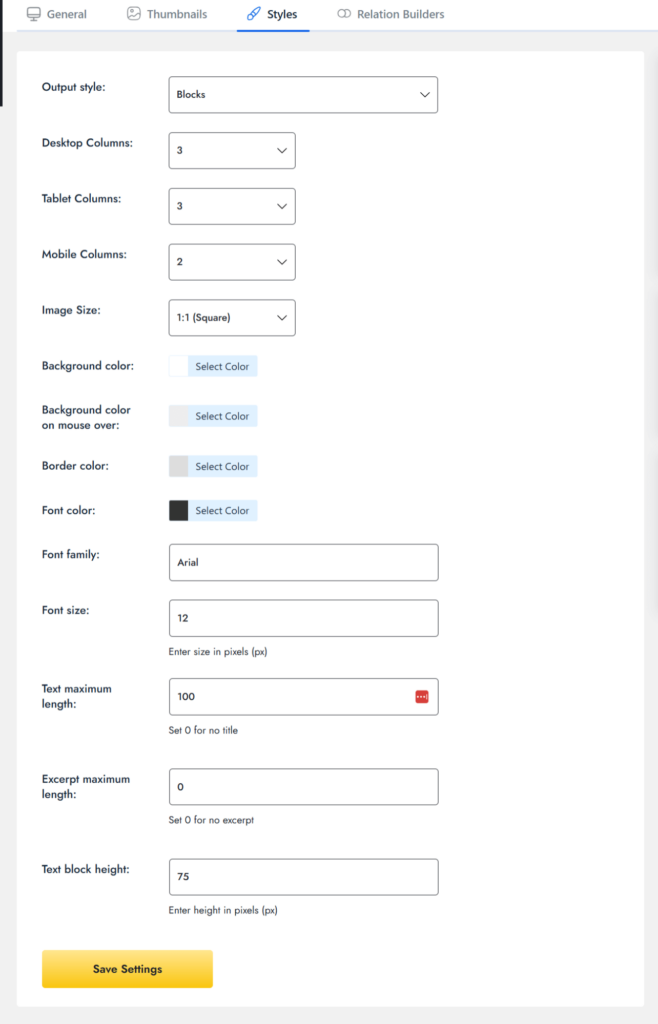
Output Style #
- Description: Determines the layout style of the related post thumbnails.
- Options:
- Blocks – Displays items in a grid/card format, perfect for a visual, attractive layout.
- List – Displays items in a vertical list, ideal for a cleaner, content-focused appearance.
- After enabling List, you will see a checkbox to Turn Off Plugin Styles:
- Checkbox: If enabled, this disables the default plugin styles, which is useful for developers or designers who want to apply custom CSS manually and fully control the layout.
- Checkbox: If enabled, this disables the default plugin styles, which is useful for developers or designers who want to apply custom CSS manually and fully control the layout.
- Recommendation:
- Choose Blocks for a visual grid layout (great for a gallery-like look).
- Choose List for a cleaner, content-focused appearance (ideal for blogs or article lists).
Desktop Columns #
- Description: Set how many thumbnails are shown in a row on desktop screens (large width).
- Example:
- 3 means 3 related posts will be aligned in one row.
- 3 means 3 related posts will be aligned in one row.
Tablet Columns #
- Description: Controls the layout on tablets or mid-sized screens (like iPads).
- Common value: 2 or 3 columns. You may experiment with this setting based on your theme’s design.
Mobile Columns
- Description: Determines how many thumbnails are shown per row on smaller screens like smartphones.
- Recommendation: Use 1 or 2 columns for better usability and clean stacking on narrow displays.
- Tip: A single-column layout on mobile ensures text and images don’t get cramped, which keeps everything readable and organized.
Image Size #
- Dropdown: Choose an image ratio or thumbnail size.
- Options: For example:
- 1:1 – Square images (uniform appearance for all thumbnails).
- Use Case: Ensures thumbnail appearance consistency regardless of the original image size.
Color Options #
The following color options allow you to customize the visual appearance of your related post thumbnails to match your site’s color scheme.
- Background Color: Sets the background color of each related post block.
- Background Color on Mouse Over: Changes the background color when a user hovers over the post.
- Border Color: Defines the color of the outer border of each thumbnail block.
- Font Color: Controls the color of text used in the post title and excerpt.
Font Options #
- Font Family: Enter the custom font name to be applied to the text (if supported by your theme or custom CSS). Leave it blank to use the default font.
- Font Size: Input the font size in pixels (e.g., 12px, 14px). This controls the size of post titles and excerpt text for better readability.
Spacing Options #
- Space Between Image and Title: Defines the vertical spacing between the image and title.
- Example: You can set this to 10px, 1em, or any other value that fits your design.
- Text Maximum Length: Limits the number of characters displayed for the post title. Set it to 0 to hide the title entirely.
- Excerpt Maximum Length: Limits the number of characters for the excerpt (content preview). Set it to 0 to hide the excerpt.
- Text Block Height: Defines a fixed height for the text area (title + excerpt). This helps align blocks neatly, even if titles vary in length.
Save Settings #
Once you’ve configured the settings to your preference, always click the Save Settings button to apply your changes on the front end.
This concludes the Styles Tab: Configuration Guide. With these settings, you can fully control how the related post thumbnails appear and behave on your site, ensuring they match your design and enhance the user experience.
Feel free to inquire about any further queries or issues regarding the styling of RPT with out dedicated support team.